Character conept pieces
Initial designs were heavily 1920's and retro future inspired. The first few concept pieces were semi-realistic in tone, while we then experimented with cartoony aesthetics, we weren't sure whether to have a serious toned story with serious looking characters, or a serious toned story with juxtapositioned with cartoony characters.


My partner in this endeavor would throw me sketches and ideas for characters as we discussed gameplay mechanics and story beats over Telegram.


Deciding on style
After the initial meeting I would spend the next week or so researching designs, costumes, murder mystery stories, and then designing the characters that would appear in the game. It did not take long for me to realise that the cartoony side would not fit too well with the story that was unfolding in front of us.
None of the following designs are considered final at the time of writing, and characters are subject to change.
Profanity warning for the scottish lass.


Further refining character designs
We decided against using the Pony-Bot. It was a funny idea while half asleep in a 7 hour meeting, but once we all sobered up, it seemed a little tone-deaf.
After creating multiple concept sketches for the characters, we looked at refining these ideas, adding colour, finalising designs, outfits, etc. These may still be rough in drawing, but convey the final tone and colour of thre characters.

The above image was drawn during the Second meeting and I am so-so on the design. Colours are fine, but the hard hat removes a lot of the poodle aesthetic.


The above is a collecton of various colour schemes for Sir Leon, the decision couldn't be made during the meeting these were drawn in, so an online Poll was made to vote on the best one.
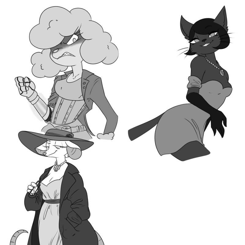


The above images are colour variations of 3 characters: Maggie, Kat and Brie. The black and white variant was initially to check how clear each character was as there were concerns of the colours being too dark. However this did bring up the question of whether the game could/should have black and white segments or not. For now this is undecided.
The less saturated version of the first colour scheme was also to see if perhaps the game would be better with a less saturated pallet than it already had, this will be discussed in a future meeting. At the time of writing I am quite happy with these character designs and consider them final until further notice.
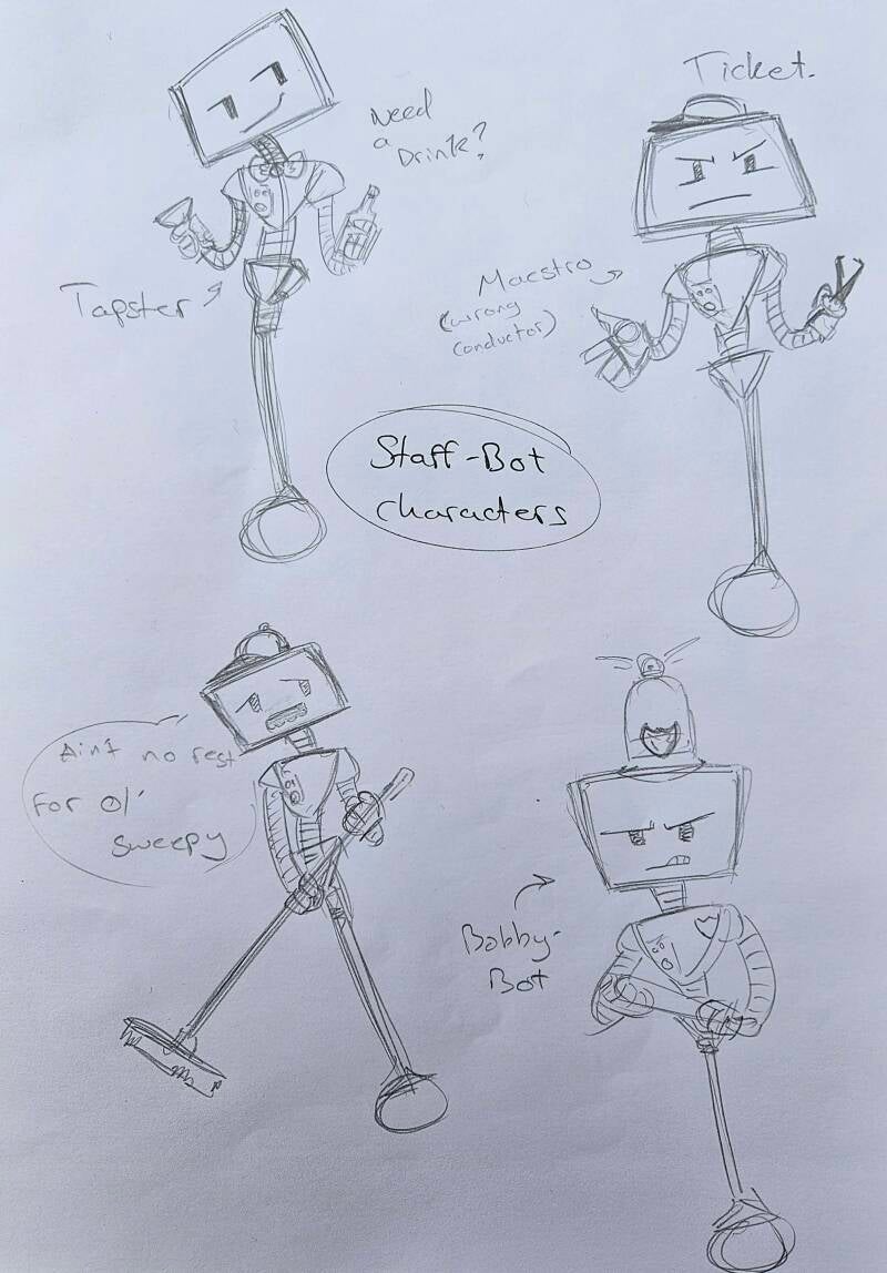
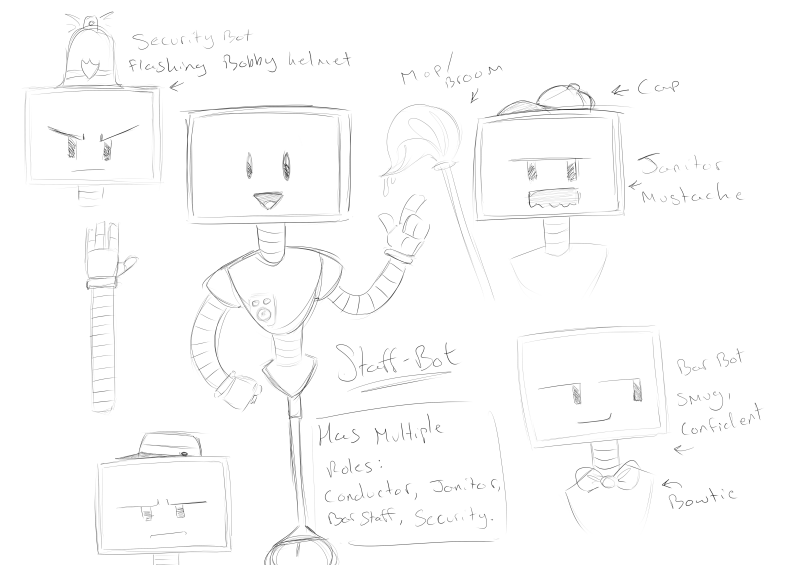
Staff-bot had a major redesign, we decided on going with a TV face design that can show multiple personalities, facial expressions or even respond to questions with imagry displayed on the screen. E.g: "Where are we going staff-bot?" Staff-bot replies "We are going to Jupiter" [Displays an image of Jupiter on it's face]
Staff-bot has 4 personalities:
- Conductor
- Bartender
- Security
- Janitor
And these all play pivotol roles in the story. Designing him was probably the hardest out of the characters, as he needed to be expressive, robotic and capable of visually showing a change in personalities. Attempts were made with small robots, similar to R2-D2 from star-wars, but these did not work out as they could not be expressive or visually show a change in personality. A decision was made to not use animal-like robots as the client thought it was too childish for a train that was all about luxury. Through a couple meetings, we were able to get the design finished.
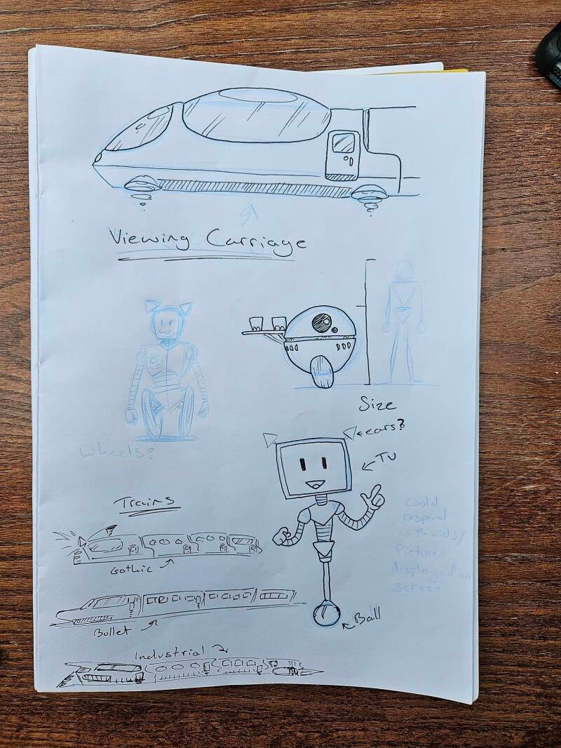
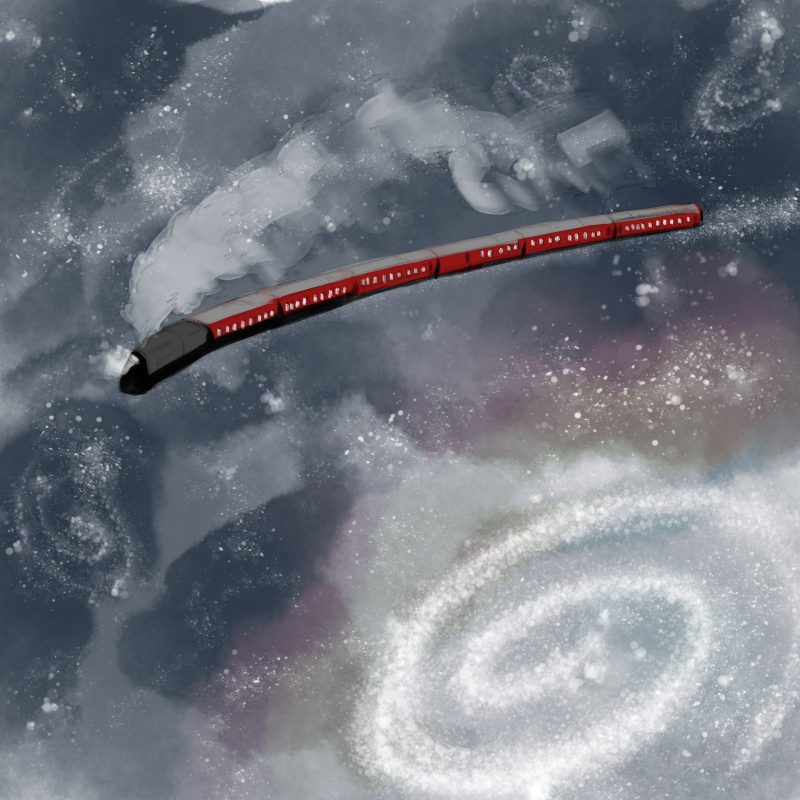
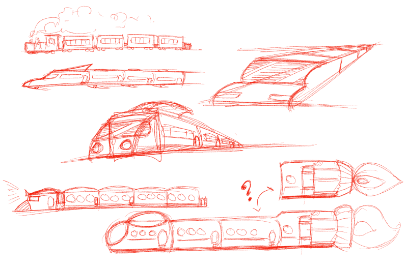
Train concept work
Before working on the train, I devised a moodboard of possible ideas for inspiration.

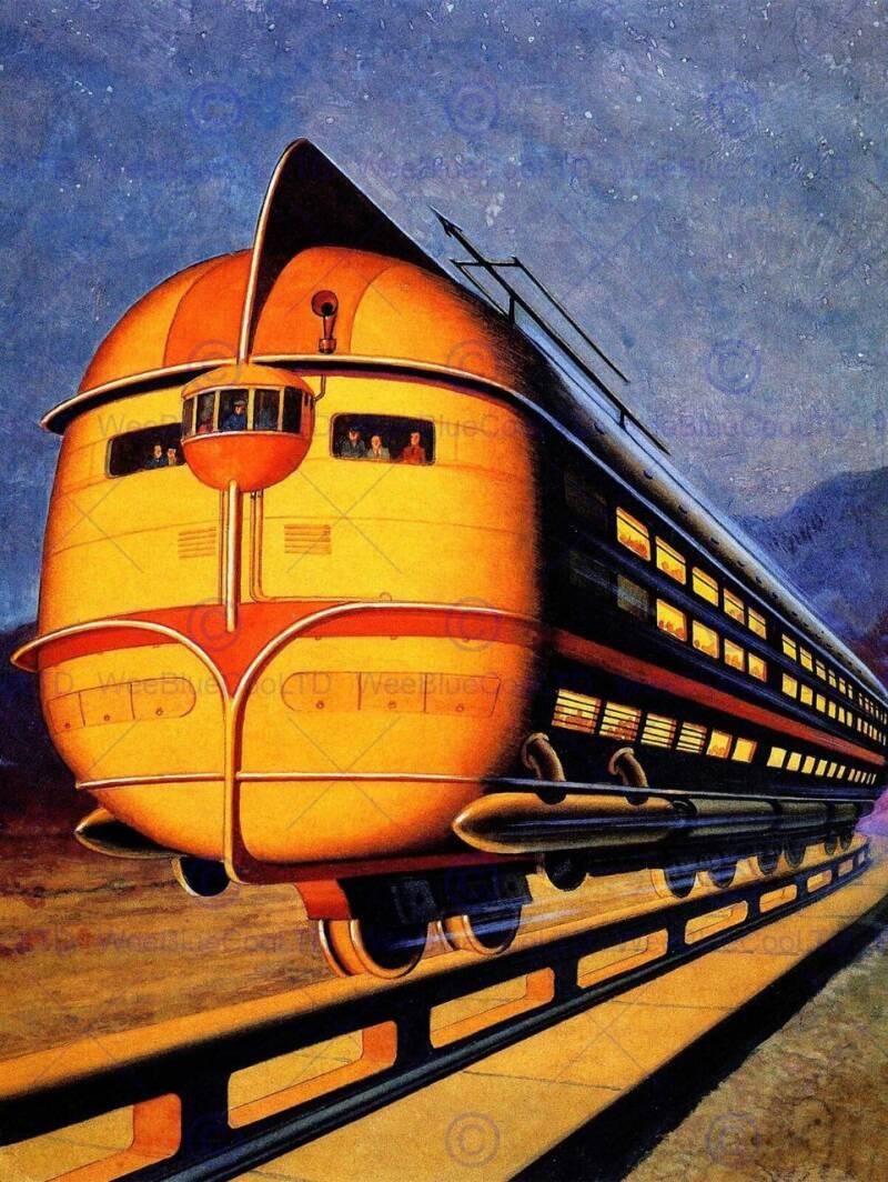


The following are concept pieces for the train itself.
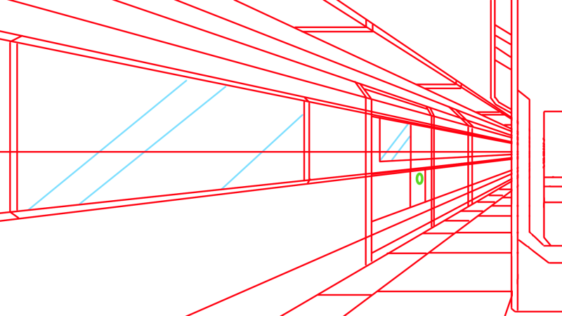
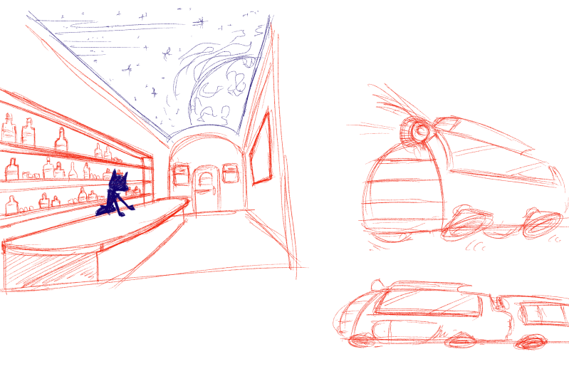
Interior train concept art
Starting off with another moodboard of images for inspiration.


This is followed by early concept designs created by me.
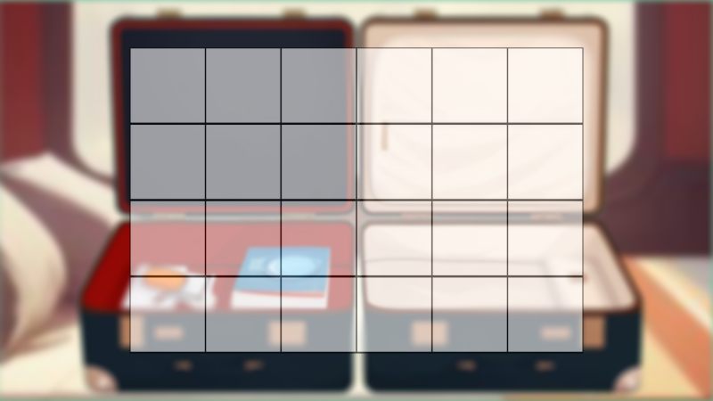
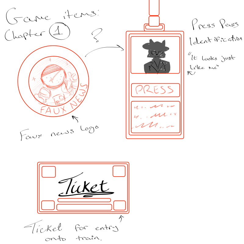
Inventory and icons
The following images are all placeholders and very rough, they are for the inventory screen and represent items you find while playing.
Create Your Own Website With Webador